Monthly Archives: March 2014

Feeling a little Vintage today

It’s a rainy spring day in Philly. Contrary to popular belief its not ALWAYS sunny in Philadelphia.

I’ve come across a couple vintage ads that I find interesting. Here’s to the new (and last?) season of Mad Men in two weeks!

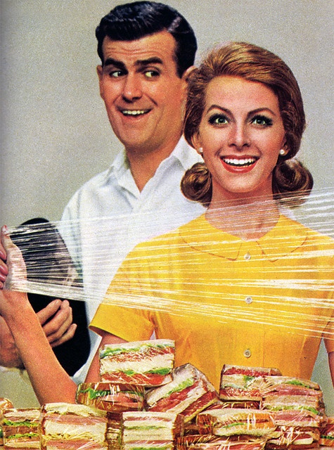
Handi Wrap
vintage-ads-5

Thanks Handi Wrap! All the easier to smother him in his sleep!

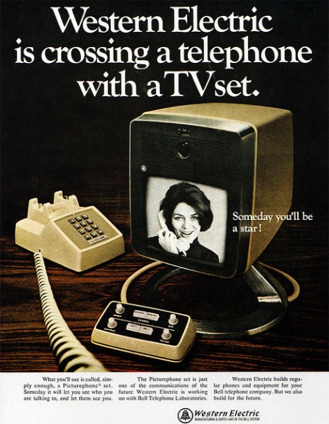
Western Electric

vintage-ads-14

Skype v. 1.0

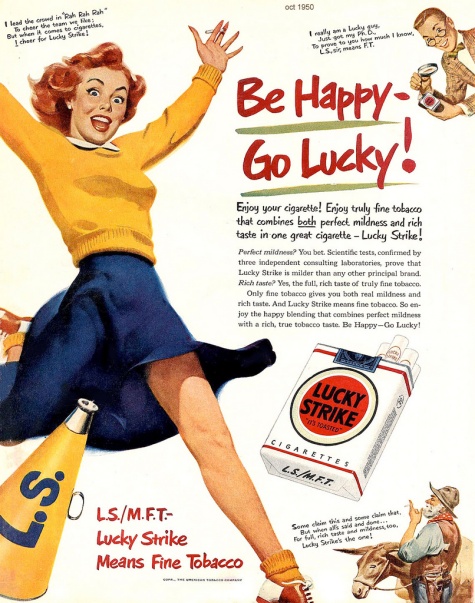
Happy Lucky!

vintage-ads-18

It doesn’t get more Mad Men than Lucky Strike. Killing yourself, one happy stick at a time!


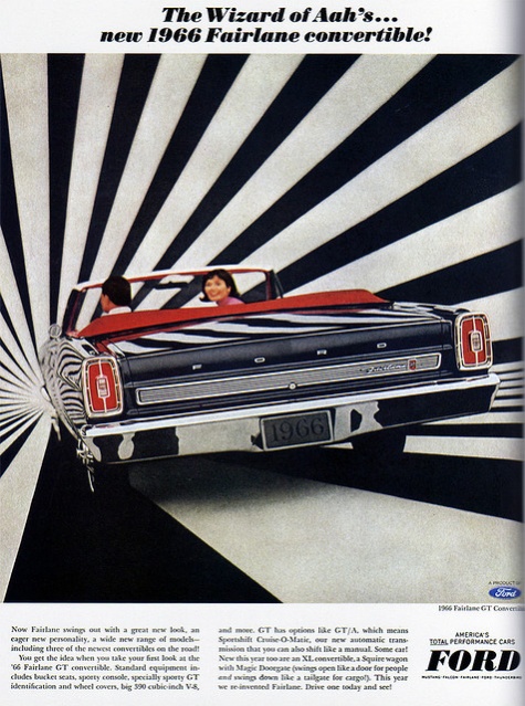
Ford fontaine

vintage-ads-4

Driving off into the tripatorium that was 1966.

Check out more vintage ads here
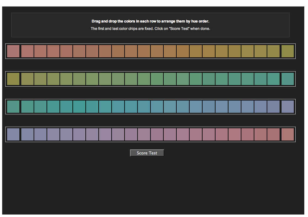
Color Challenge

Take the color test here.

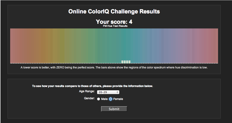
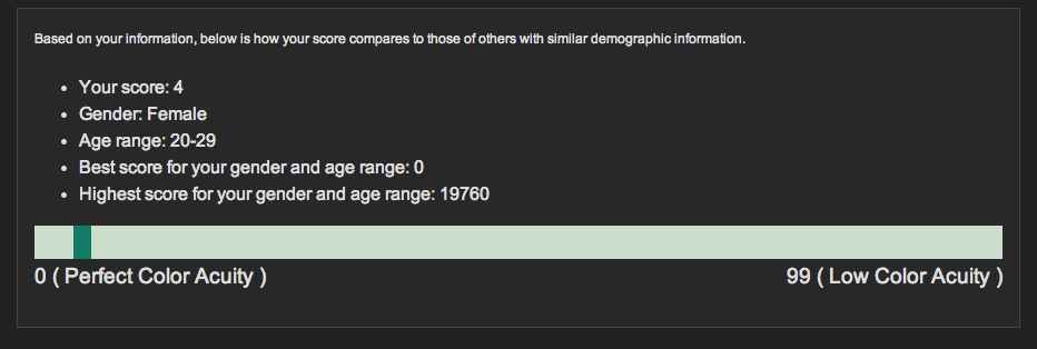
How well do you see color? FACT: 1 out of 255 women and 1 out of 12 men have some form of color vision deficiency. Take the online color challenge, based on the Farnsworth Munsell 100 Hue Test.

Lets see how I did.

Screen Shot 2014-03-13 at 10.59.11 PM

Screen Shot 2014-03-13 at 10.59.35 PM

Screen Shot 2014-03-13 at 10.59.50 PM


Not shabby. How did you do?

Searching for inspiration, finding Danny

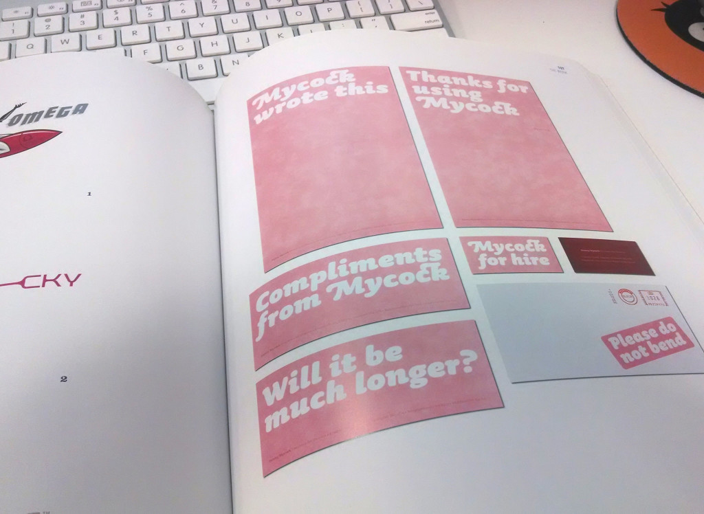
I was searching for some logo/branding inspiration on friday, and came across a designer & Art Director named Danny Mycock.

2014-03-07 14.22.25

According to http://www.campaignlive.co.uk/news/228707/, this design system won him Best Corporate Design in the 2004 Fresh Awards! The brief stated the purpose of this project was, “For Danny to get his name noticed”.

Time to Jump in!

Alrighty, I’ve had this thing for close to a year now.
I’m sorry I’ve been neglecting you, blog.

I’m a year wiser, with a little bit more experience than the fresh faced
graduate who posted last. I’m committed this time, I promise! Let’s start
off by figuring out how to start and run a successful blog! So where do we go?
pshh Wiki of course!

http://www.wikihow.com/Start-a-Blog

Ask yourself what you love, care about or wish to share with others.

Number 1! (and the only number I’ll cover)
Well this is my design website, so I guess I should talk about
design related stuff…….right? A place to share inspiration, successes,
failures and all things design. An outlet, when nobody else wants to
hear about how terrible the kerning is on that burger joint’s sign.

I am passionate about making great looking things. I like to laugh. A lot.
I really think its the only way to stay sane in this crazy world. I hope for
this to be an outlet for both of those things.

So…here’s to the beginning of something. I’m not sure what exactly that
something is quite is yet, but it’s something.


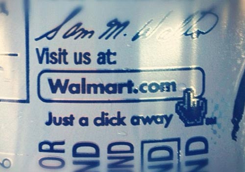
walmartclick
Seriously though, kerning matters, folks.