Brand Identity created for a plumbing company.
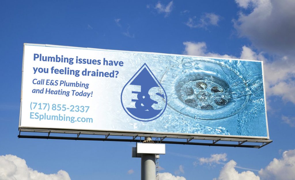
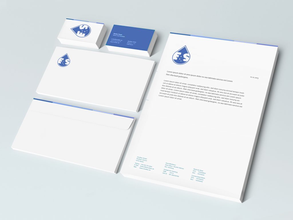
Brand Identity created for a plumbing company.


Happy beautiful Friday: it’s 75 degrees in February, surely can’t complain about that.
Ending the week with some branding identity. The client didn’t end up going with this one, but I’m a fan of it, so I thought I would show it off anyway.
This logo was created for a new local referral group with two options for use. Stand alone or negative space version within the a vector of the County in which this group operates.
As the last few days of the year are winding down, it’s always a good time for some reflection on the past 12 months and the projects I’ve completed during them. Below are a few of my favorites:
KSTG Website
Website created for transportation company.
Above Standard Tile Logo Development
Sometimes the coolest projects you end up getting in the least expected places. I developed a logo for a Flooring company that prides itself on the standard in which they produce their work. Symmetric shapes are the foundation for the concept of this logo design.
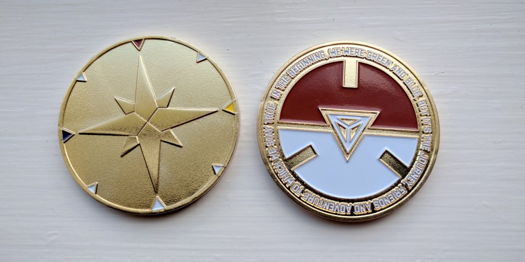
Pokegress Coin
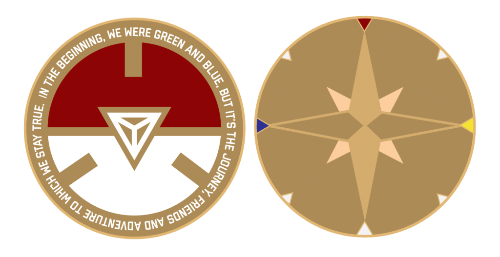
Commemorative coin created for the gaming community that plays Ingress and now Pokemon go. Ingressers were the pioneers of ARG and this coin was widely sold to those who have weathered the seasons of the change in gaming. Coin is still available for sale here.
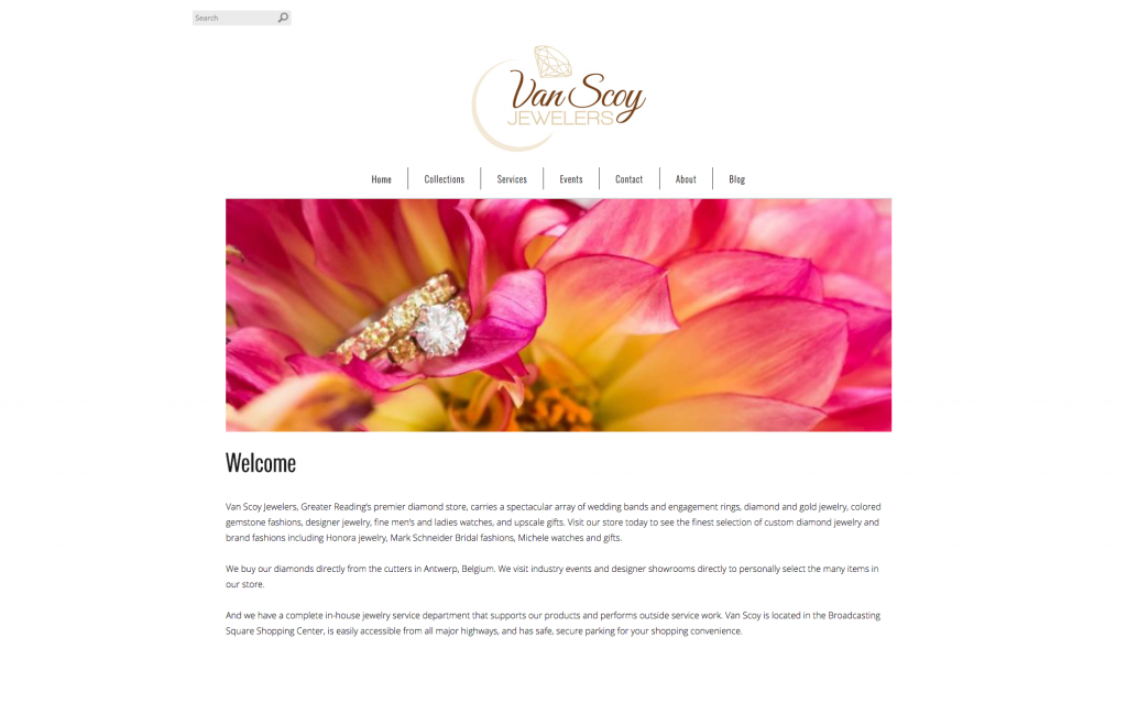
Vanscoy.com Website Design
Clean, functional website that was designed for a local jewelry store.
Happy New Year and here’s to a bunch of great new projects in 2017!
Another few months have gone by. I’ve been busy working on a few new projects, including a couple logo designs that I want to share today!
First up, a brand new start-up company that creates awesome pieces of decorated metals. The client in this case knew pretty much exactly what they wanted. I just had to work out the kinks.
Exotic Chrome logo
with color
Next project was for a company that specializes in flooring & tile. Geometric graphics were used to create the lettering, which is representative of the tiling and flooring services this company provides. When the letterforms are organized vertically, it resembles an arrow pointing upwards. This is a great symbolization of the quality of work being above standard.
The year is almost over, time for some big changes! It was time to do away with my freshly out of school branding design and create a brand identity that better suits my current and future business. A little older, a little wiser, I might add. 🙂
I’ve been toying with this AM type idea for months in my free time, it finally came together.
Color variations
white on black