Happy beautiful Friday: it’s 75 degrees in February, surely can’t complain about that.
Ending the week with some branding identity. The client didn’t end up going with this one, but I’m a fan of it, so I thought I would show it off anyway.
Happy beautiful Friday: it’s 75 degrees in February, surely can’t complain about that.
Ending the week with some branding identity. The client didn’t end up going with this one, but I’m a fan of it, so I thought I would show it off anyway.


This logo was created for a new local referral group with two options for use. Stand alone or negative space version within the a vector of the County in which this group operates.
As the last few days of the year are winding down, it’s always a good time for some reflection on the past 12 months and the projects I’ve completed during them. Below are a few of my favorites:
KSTG Website
Website created for transportation company.
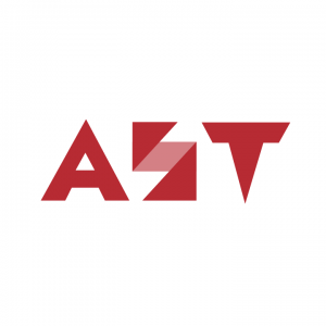
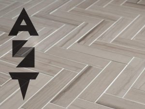
Above Standard Tile Logo Development
Sometimes the coolest projects you end up getting in the least expected places. I developed a logo for a Flooring company that prides itself on the standard in which they produce their work. Symmetric shapes are the foundation for the concept of this logo design.
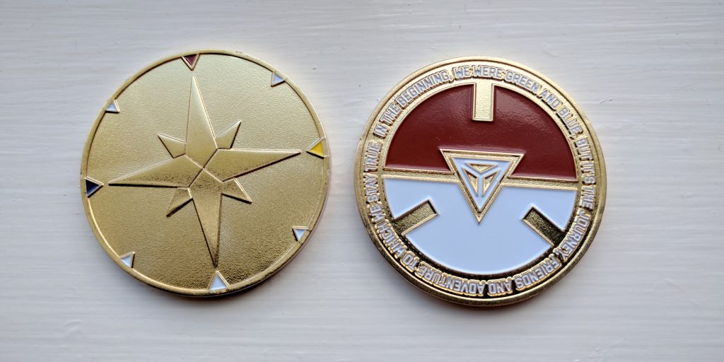
Pokegress Coin
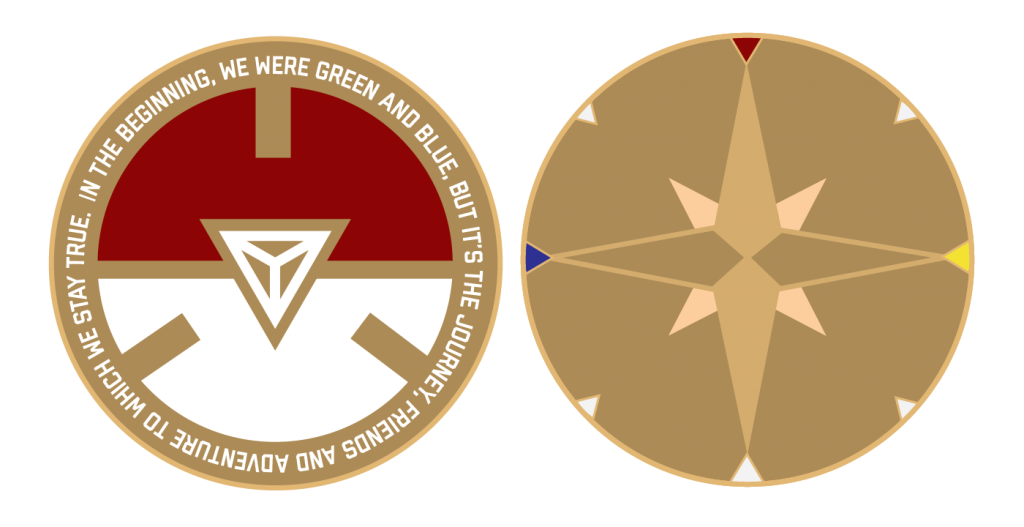
Commemorative coin created for the gaming community that plays Ingress and now Pokemon go. Ingressers were the pioneers of ARG and this coin was widely sold to those who have weathered the seasons of the change in gaming. Coin is still available for sale here.
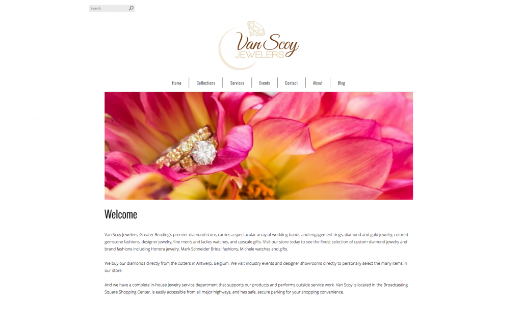
Vanscoy.com Website Design
Clean, functional website that was designed for a local jewelry store.
Happy New Year and here’s to a bunch of great new projects in 2017!
Another few months have gone by. I’ve been busy working on a few new projects, including a couple logo designs that I want to share today!
First up, a brand new start-up company that creates awesome pieces of decorated metals. The client in this case knew pretty much exactly what they wanted. I just had to work out the kinks.
Exotic Chrome logo
with color
Next project was for a company that specializes in flooring & tile. Geometric graphics were used to create the lettering, which is representative of the tiling and flooring services this company provides. When the letterforms are organized vertically, it resembles an arrow pointing upwards. This is a great symbolization of the quality of work being above standard.
I cracked! I finally made a Facebook business page for AM Creative. If you sold your soul to our data mining overlords, please go “Like” my page! Everyone knows Facebook has a pretty epic design team. With the amount of money they bring in I wouldn’t expect any less. Speaking of likes, whats new in the world of facebook design?

(Photo : Getty Images/ AFP)
Ever saw a disheartening Facebook post that made you want to show support, but you didn’t want to do it by liking the post? Even leaving a comment would seem a bit awkward wouldn’t it?
In an interview with Bloomberg, Facebook Chief Product Officer Chris Cox announced that the company would be creating five new variations of the Like button. Only thing is, none of the variations will be a dislike button.
Users will get the option to hold the Like button down and choose of five options – angry, sad, wow, haha and love. The reactions would pop up as animated emojis.
Here’s what Cox said in the interview about the option: “Within the company, there was some debate on how to add the options without making every post look crowded with things to click. The simpler Facebook is to use, the more people will use it. Zuckerberg had a solution: Just display the usual thumbs-up button under each post, but if someone on her smartphone presses down on it a little longer, the other options will reveal themselves. Cox’s team went with that and added animation to clarify their meaning, making the yellow emojis bounce and change expression. The angry one turns red, looking downward in rage, for example. Once people click their responses, the posts in News Feed show a tally of how many wows, hahas, and loves each generated.”
This will not only complement users but also analysts, marketers and advertisers.
“These new buttons give them so much more information than the Like button,” said Patrick Moorhead, an analyst with Moor Insights & Strategy. “With that, they can better target ads and offers. This could be very valuable since better-targeted ads are better performing and more expensive.”
Facebook CEO Mark Zuckerberg announced in September that the social network was going to be having new Like options. This new ability to provide more input with less effort is a clever effort, and it seems not only make users happy but also businesses as well.
A creative job can be a heck of a lot easier in a creative atmosphere.
So, I decided to ditch the white walls and go for something unique. Here is my progress:
Welcome to my new office! Next thing is replacing the carpet…
Read Full article here
It’s a challenge many designers are faced with. How can I make a successful logo? Here are a good few questions to ask yourself when looking at a preliminary logo design:
1. What emotions does the logo evoke?
Colors can play a big part in evoking emotional response.
2. What’s the meaning behind the logo?
No one ever wants to hear, “because it looks cool”. Find a deeper meaning.
3. Will the logo stand the test of time?
No logo will last forever, but generally a great logo could last up to a couple decades.
4. Is it unique? Can it be instantly recognizable?
Do some research, see what other company logo’s look like in the field. Then make it completely different.
5. How does it look in black and white?
I suggest starting in black and white. It’s sometimes easier to introduce color in after nailing down the design.
6. Is it clear and distinct in small dimensions?
Shrink it down, can you still see it?
Not a whole lot of hierarchy here, but otherwise some good advice. Sometimes we all hit a lull in creativity!